

Rebrand, logo design, can & packaging design.
Rebrand & Beer Can design concepts for Alley Kat Brewing.
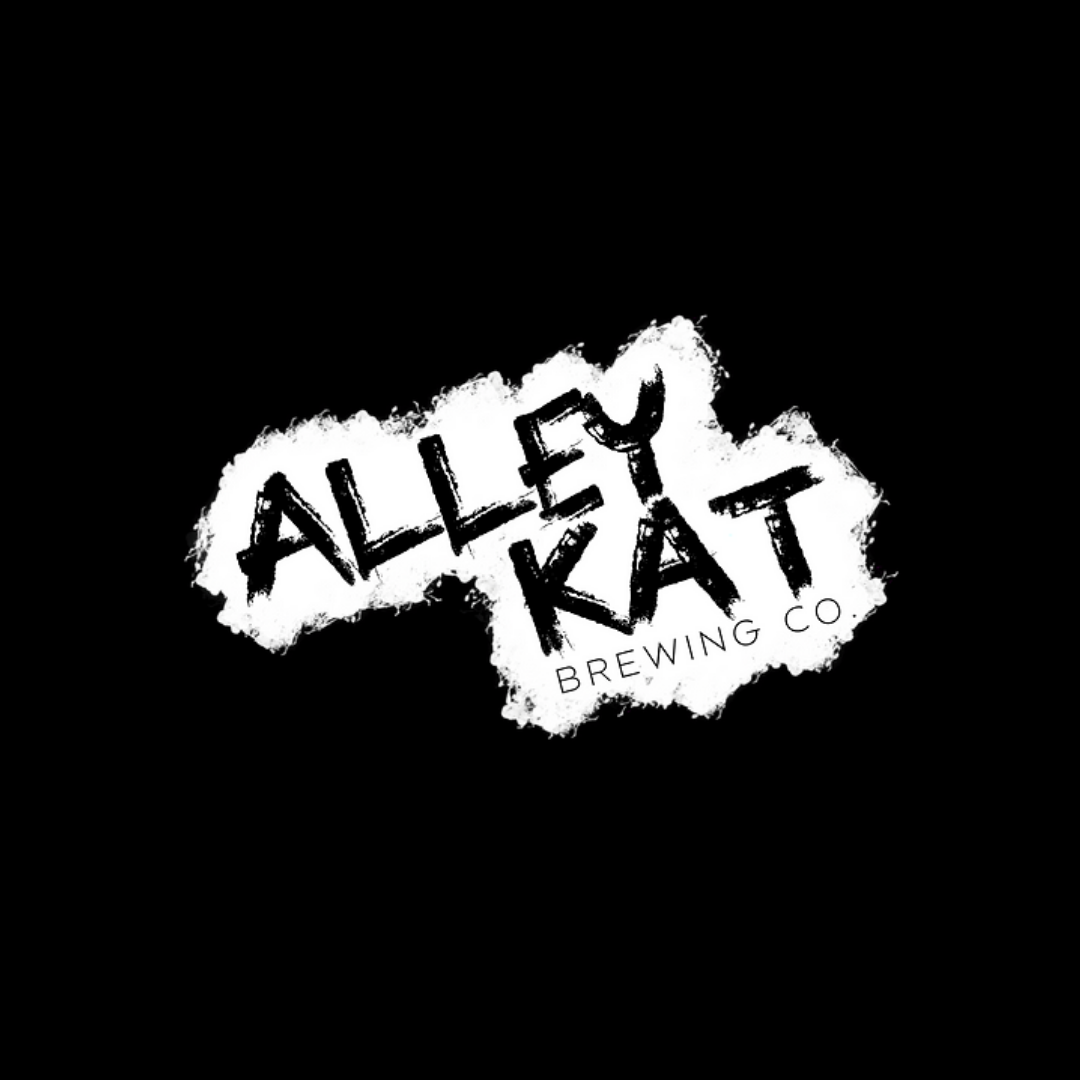
Original Brand
Alley Kat Brewing
Overall lack of harmony in styles used.
Brush font used for logo more of a trend than a brand that has legacy lasting power. It also doesn’t give up much information about the personality of the brand.
Can design is a bit overwhelming to the eye; information is not immediately found by the eye and supporting graphics not necessarily complimenting the contents of the can.
Goals: Find the brand’s personality and essence. Design a logo that is more memorable with better scalability. Create new can designs that are fun, but easy to digest, that compliment the brews inside.


Logo Redesign
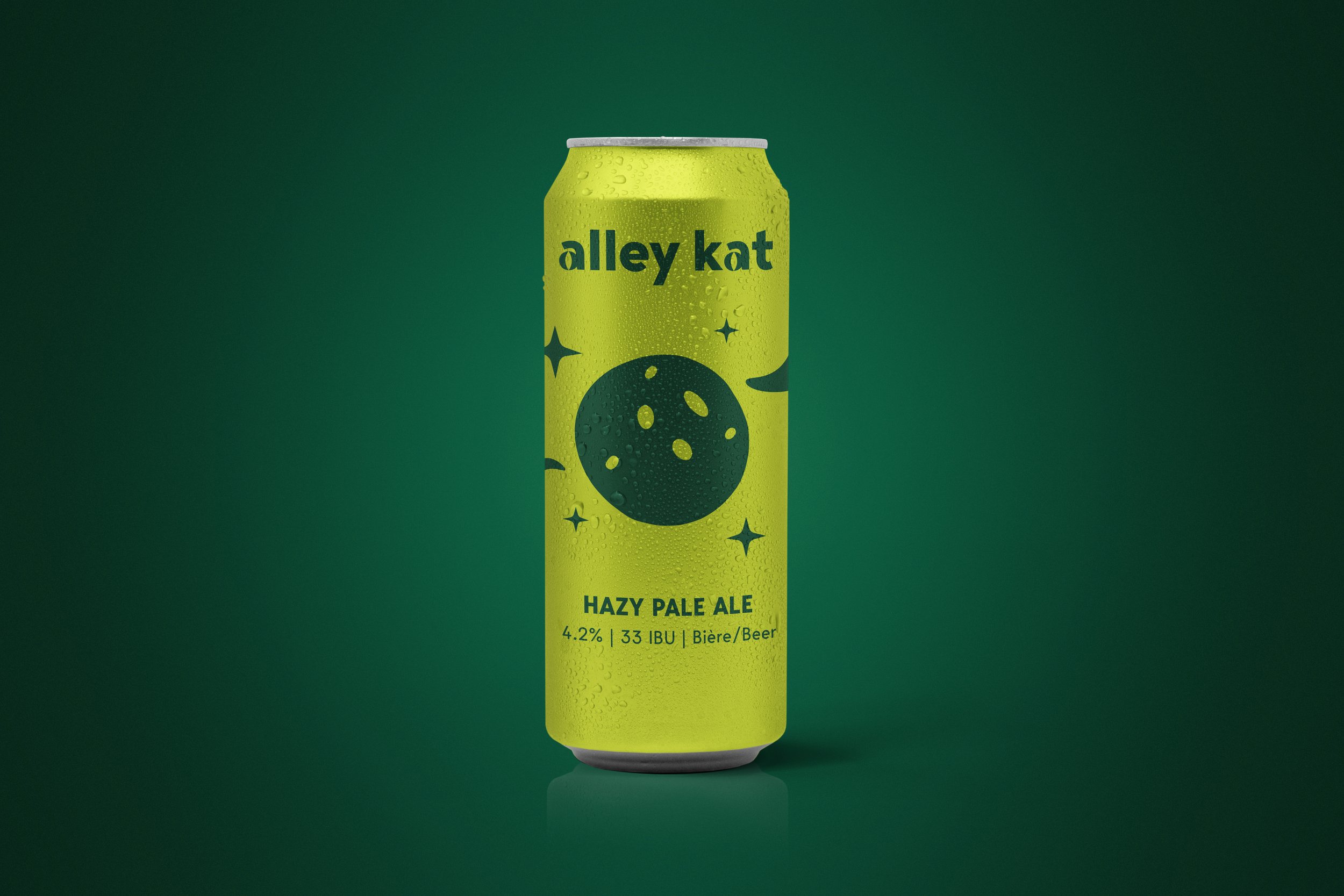
Custom crafted word mark.
Clean and scalable. The typographic choice of clean verticals reminiscent of the roads and “alleys” in the city, with a subtle but effective ode to the feline sharpness of the brand in the a characters. Fun, cheeky, but still classy.

Can Design
Illustration/Product Design
Fun and spunky cans that have continuity from a similar illustration style. Bold, blocky illustrations that hint to the flavours and experience inside the can. Colourfully diverse, but still belonging to the same visual family. Santé!


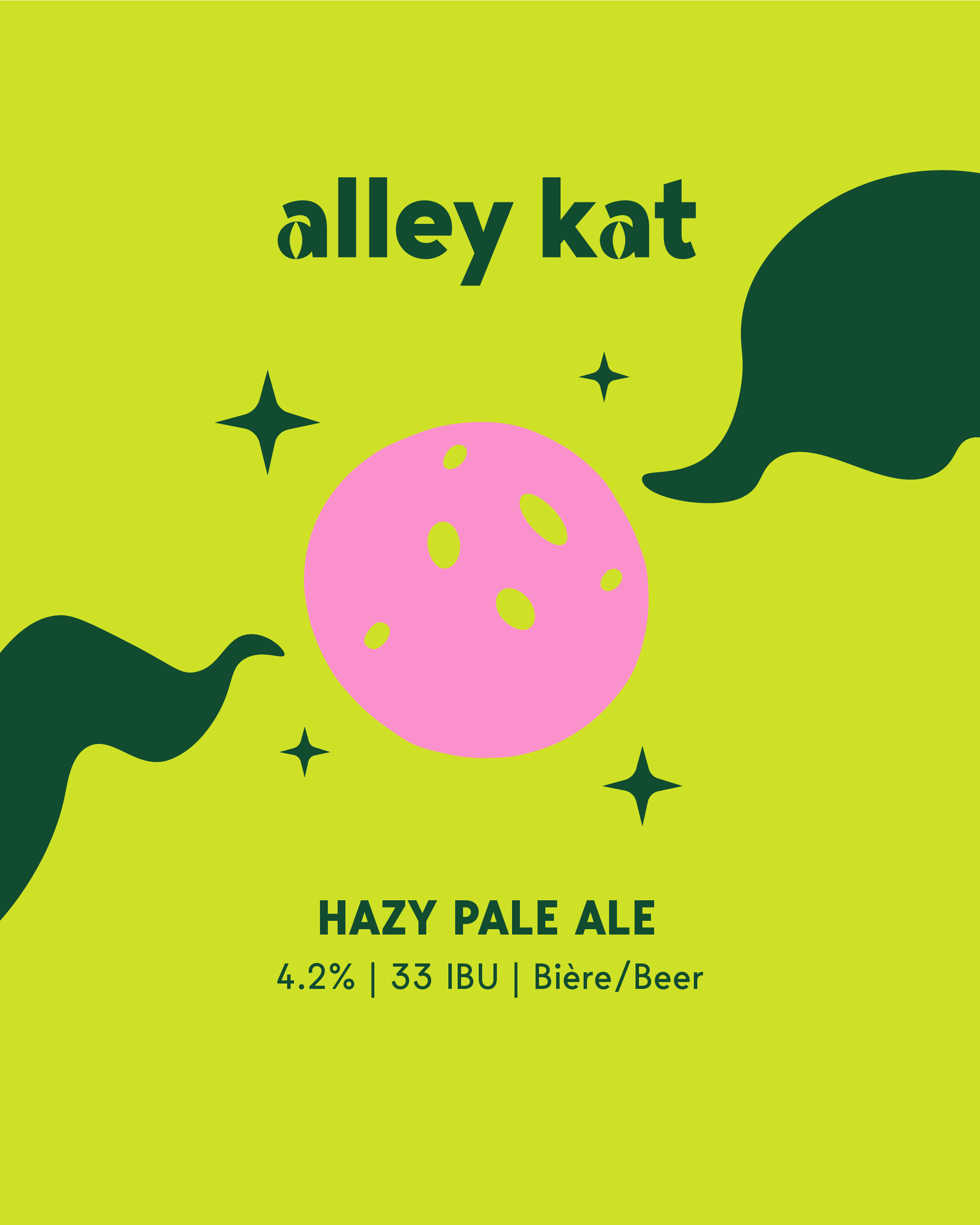

Alternate Designs
Mixing Colour
Considered playing further and adding in a pop of colour element on each can design. Ultimately decided to stick with two tone cans for elegance and continuity across the shelf.